We will throw in at no extra charge this awful instance of apostasy.
Sometime in 1814, Stockbridge (Mass.) printer Heman Willard found himself with a problem. Even though he ran a thriving shop in the Berkshires (rivaled perhaps only by the Jeffersonian printer/publisher Phinehas Allen in Pittsfield) and had been publishing a moderately successful Federalist newspaper (the Western Star, succeeded in 1806 by the Berkshire Reporter), he no doubt depended on maintaining his reputation of delivering good work as promised.
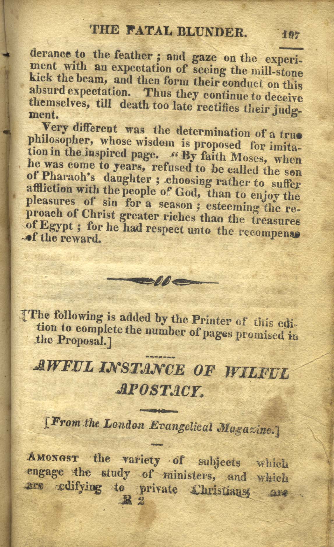
So when Willard found he was nearly an entire gathering short on delivering this edition of the latter day Puritan meditations of the famed Calvinist Robert Hawker’s Zion’s Pilgrim (“From the fourth London edition,” and no doubt well-suited to a Berkshire revival atmosphere during the Second Great Awakening) he freely admitted in the very columns of his job that he has decided to include an “Awful Instance of Wilful Apostacy,” which per his note, “is added by the Printer of this edition to complete the number of pages promised in the Proposal.”
Perhaps we can get just a little more space between this initial quotation mark and the following letter?
And thus does Willard fulfill at least the letter of his agreement, resorting to five pages of perhaps the most expansive letter-spacing this cataloguer has seen in 19th century American printing.
This copy also sports the contemporary ink ownership signature to the front blank, “Sally Pease Her Book price four shillings.” (Her signature repeated in the rear endpapers.) An early owner–presumably Pease–has curiously reinforced the edges of the free endpapers with burlap or a similar coarse unfinished cloth. An early Pease has also repeated the family surname in looping pencil throughout the endpapers. If that was not enough to make this a remarkable find, two conjugate leaves are detached, each with closed tears across the leaves (hinting at the remote possibility of uncollected cancelands).
For all of its charms (which phrase of course the jaundiced student of bookseller descriptions might choose to read as “for all its flaws”), this is a nice little example of a Berkshire imprint. See the full description on our website here.